Let’s Create a Chart
Let’s Start Plotting Charts with Python (No, I’m Not Teaching You Python)
Hey there — Ozy here.
In this post, we’re diving into the very beginning of using Python to create candlestick charts. But before you panic — no, I’m not here to teach you Python from scratch. I didn’t learn this stuff to become a software engineer, and I’m guessing you didn’t come here for that either.
I started learning code because I wanted to see my trading ideas on a chart without spending hours clicking around on clunky platforms. That’s what this is all about: using Python to make your own tools, even if your code isn’t perfect (mine sure isn’t).
What You’ll Get From This Blog
We’re starting with basic chart plotting — just enough to get you familiar with what’s possible. You’ll be able to see candlesticks, adjust timeframes, and play around with simple customizations.
This is not a tutorial, and I won’t be walking you through Python line-by-line. What I will do is give you ready-to-run code in future posts, with explanations you can actually understand — no fluff, no fake guru stuff.
Why Start Here?
Because charts are where it all begins. Before we jump into candlestick patterns, support/resistance levels, or Smart Money traps, you need to build your own charting foundation. That’s what this post is about.
You’ll be able to:
-
Run code that displays your first candlestick chart
-
Change how it looks (colors, sizes, themes)
-
Plug in your own data if you want to explore
What’s Coming Next?
Once we’ve got charts working, we’ll move into the fun part:
Finding patterns and behavior that actually matter.
Upcoming topics will include:
-
Detecting candlestick types like Doji, Hammer, Engulfing, etc.
-
Pattern recognition using logic and price structure
-
Drawing support & resistance automatically
-
Price action setups like liquidity grabs and trap zones
-
Smart Money Concepts with code you can actually use
-
And yes — building your own signal system from scratch
You’ll always be free to take what I write and make it better. That’s the beauty of coding — once you start, you realize you can tweak and test everything your own way.
So if you’re ready to take the first step — not into “learning to code” but into building your own trading tools — you’re in the right place.
Let’s go.
ozy
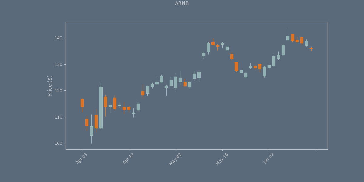
    from tvDatafeed import TvDatafeed, Interval
import mplfinance as mpf
from datetime import datetime, timedelta
import pandas as pd
from ggplot import ggplot  # Import the style function

## Initialize TVDataFeed (no login needed for public data)
tv = TvDatafeed()

## Set parameters
ticker = 'ABNB'
exchange = 'NASDAQ'  # Change if needed for your instrument
start_date = datetime(2024, 1, 1)
end_date = datetime.now()

## Fetch data from TradingView
data = tv.get_hist(
    symbol=ticker,
    exchange=exchange,
    interval=Interval.in_daily,  # Daily candles
    n_bars=50,  # Get enough bars to cover your date range
    extended_session=False
)

## Convert to proper DataFrame format
data.index = pd.to_datetime(data.index)
data = data.rename(columns={
    'open': 'Open',
    'high': 'High',
    'low': 'Low',
    'close': 'Close',
    'volume': 'Volume'
})

## Filter for date range
data = data[(data.index >= start_date) & (data.index <= end_date)]

## Get the style from the separate file
ggplot_style = ggplot()

## Plot candlestick chart
mpf.plot(
    data,
    type='candle',
    style=ggplot_style,
    title=f'{ticker}',
    ylabel='Price ($)',
    volume=False,
    figsize=(12, 6),
    datetime_format='%b %d'
)

    import yfinance as yf
import matplotlib.pyplot as plt

# Download data
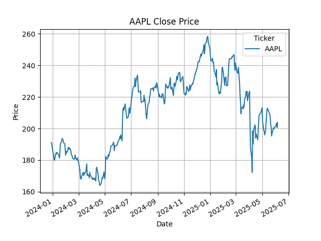
data = yf.download("AAPL", start="2023-12-29", end="2025-06-09")

# Plot Close price
data['Close'].plot(title="AAPL Close Price")
plt.xlabel("Date")
plt.ylabel("Price")
plt.grid()
plt.show()

    import ccxt
import mplfinance as mpf
import pandas as pd
from datetime import datetime

# Initialize exchange
exchange = ccxt.binance()

# Define date range
start_date = "2025-05-01"
end_date = "2025-06-01"

# Convert to timestamps (in milliseconds)
start_timestamp = int(datetime.strptime(start_date, "%Y-%m-%d").timestamp() * 1000)
end_timestamp = int(datetime.strptime(end_date, "%Y-%m-%d").timestamp() * 1000)

# Fetch data (using 4-hour candles for better granularity)
timeframe = '1d'
symbol = 'BTC/USDT'
ohlcv = exchange.fetch_ohlcv(symbol, timeframe, since=start_timestamp, limit=1000)

# Create DataFrame
df = pd.DataFrame(ohlcv, columns=['time', 'open', 'high', 'low', 'close', 'volume'])
df['time'] = pd.to_datetime(df['time'], unit='ms')
df.set_index('time', inplace=True)

# Filter for our date range
df = df.loc[start_date:end_date]

# Plot candlestick chart
mpf.plot(df,
         type='candle',
         style='charles',
         title='BTC/USD Daily Chart',
         volume=False,
         datetime_format='%m-%d %H:%M',
         show_nontrading=False)


